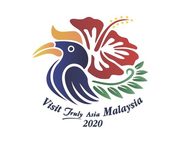
Something is Visibly ‘Off’ With The New ‘Visit Malaysia 2020’ Logo…
 Thirsty for JUICE content? Quench your cravings on our Instagram, TikTok and WhatsApp
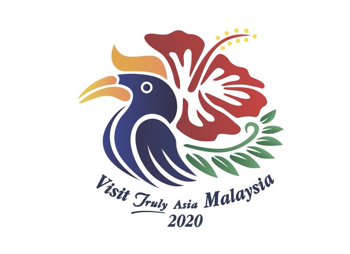
Recently, the new Visit Malaysia 2020 logo was launched by Prime Minister, Tun Mahathir Mohamad, but Malaysians were quick to realise that something was definitely wrong with the typography of the logo.

The new logo, while pleasing to the eye in terms of aesthetics, makes Malaysians scratch their heads at the awkward grammar. “Visit Truly Asia Malaysia” not only goes against the brand and tagline we have gotten used to for years which is, “Malaysia, Truly Asia” but it just sounds wrong in terms of grammar. Plus, our jingle won’t sound the same anymore which is saddening…
Lets embrace our beautiful journey towards Visit Malaysia 2020. #Mketapi #MyMOTAC #VisitMalaysia2020 #RakanMOTAC pic.twitter.com/LNBRqCafkJ
— Mohamaddin Ketapi (@MKetapi) July 22, 2019
Despite the massive amount of criticism faced by the public, Tourism and Culture minister, Mohamaddin Ketapi (the guy that hashtag-ed his own name on the tweet attached to the newly launched logo), said,
“The usage of the English language in the logo was correct and only those who were not well-versed with the language would deem the phrasing as wrong.”
Sheesh… Calm your horses with that sharp perli to Malaysian citizens please.
To make matters worse, it has been circulating around the internet that the logo might be plagiarised. These allegations were denied swiftly by Ketapi and he even called the public foolish for believing hoaxes pertaining to the plagiarism of the logo.
1. First photo is widely distributed, claiming that Visit Malaysia 2020 logo is ‘plagiarized’ from stock images.
2. Take note that the logo is NOT the official logo as claimed.
3. The stock image is different from the official logo.
4. This is the actual logo rationale pic.twitter.com/Kmq1TwKpZ4
— Asrul Muzaffar (@asrulmm) July 23, 2019
As with anything in this world, people are bound to get unhappy because of course, you can’t please everyone. However, when a massive majority of people are speaking out against something, maybe you should lower your ego and listen instead of shutting the world out in fear of being challenged.
Here is the tweet that perfectly illustrates the general consensus of the new logo.
Better than the previous logo (the benchmark is really low), but…is that a Thanksgiving turkey? A hen? And what’s with that ‘Visit Truly Asia Malaysia’ tagline?
A logo should be simple enough that everyone, even a schoolchild, can re-sketch it. This one seems too busy. https://t.co/A7t1OS2h2Z
— Faizal Hamssin (@faizalhamssin) July 22, 2019
To compare with the old logo would be an insult to capable graphic designers everywhere because of its sheer lack of effort and passion. See for yourself down below.
Visit Malaysia 2020 new logo. What say you? #VMY2020
Old logo. New logo. pic.twitter.com/xFLKBvhuB0
— falihinjasmi (@FLjasmy) July 22, 2019
Some Twitter users are even submitting other designs that they feel are more deserving.
i wish this was the official one pic.twitter.com/xUGj8goWm6
— Nas (@NasSuha_) July 22, 2019
All in all, our complaints fall on deaf ears as Ketapi refuses to alter the logo or the tagline in any way shape or form. So, I guess it’s “Visit Malaysia Truly Asia 2020” for us after all. Don’t worry though, maybe the climate change will kill us before the new year rings.
I’m signing off with this gem. Cheers!
I fixed it for you guys. pic.twitter.com/G0xAj9k7lI
— Roman Akramovich (@SyedAkramin) July 22, 2019
For more news, keep it here at JUICE!


 Get Audio+
 Hot FM
 Kool 101
 Eight FM
 Fly FM
 Molek FM


