High School Seniors Design Netflix-Themed Layout For Their School Magazine & It Looks Amazing
 Thirsty for JUICE content? Quench your cravings on our Instagram, TikTok and WhatsApp

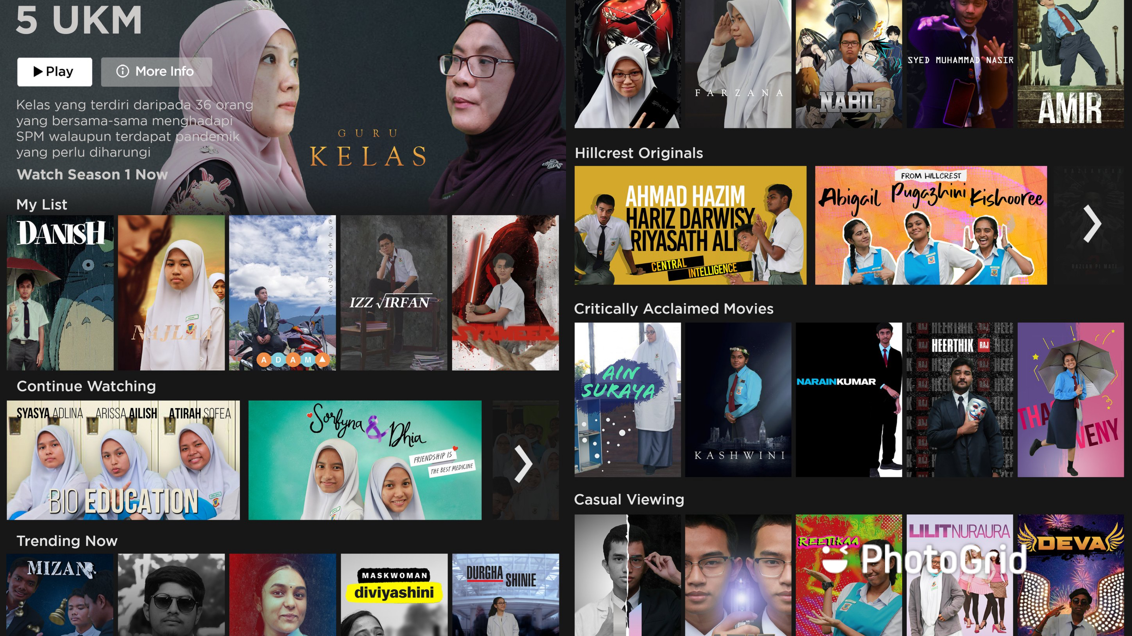
A perk that comes with being a senior student in secondary school is that you get to have a special spread in the school’s magazine for your class. This year, the seniors of SMK Hillcrest have gone all out to make their class spread memorable and truly cool by designing a Netflix-themed layout.
Pictures of students and their teachers were photoshopped into different movie posters and laid out in the style of the Netflix’s home screen.
JUICE had the opportunity to talk to one of the representatives of the team, Muhamad Adam Syafi Bin Mohamed Amir.
For Majalah Sekolah✨ pic.twitter.com/TM5ujT6Njz
— Adumb (@dumbhaji) October 2, 2020
Adam mentioned that the team consisted of 5 people including Muhammad Izz Irfan Bin Shamsuddin, Mizan Zaini Bin Mohd Mustakim, Nor Danish Imran bin Nor Hisham and Syameer Hafizal Bin Samsuddin with roles such as editors and photographers.
When asked about their inspiration, Adam explained that it came from a tweet of a previous class doing a Spotify-themed album for their class’ spread which led Adam’s group to turn it up a notch by taking on the Netflix design and executing it to perfection.

Adam also stated that the class discussion regarding the theme began in early January but the real work only started in June – when students were allowed to attend school again making this a challenge for them due to their busy schedules, catching up with classes and following strict SOPs.

“We were only given a week and a half at best until the given deadline. This meant we had to complete the photography and editing in that time span. Moreover, there are SOPs that we need to follow. All the group photos had to be taken individually and combined during the editing process,” he said.
“This process took more time than what we had planned before. Not to mention, shortly after the deadline, we needed to attend the post-MCO exam required for all Form 5 students,” Adam continued.
Aaa nak jugak (become a doctor cuz kitorang science stream hehe) https://t.co/KExb8x0hln pic.twitter.com/vHnFEFkwXt
— ノ(・ω・)ノ (@xxsyaffiainxx) October 2, 2020
Adam’s class’ design has since inspired other seniors to design layouts in the style of Spotify’s new layout and Pinterest.
this one yang clear version https://t.co/WcX2H2dJhp pic.twitter.com/rWg8Au2unI
— (@fatinnhshm) October 2, 2020
We tip our hats to these amazing students for creating such a beautiful magazine spread for their final year despite having to sit for the SPM soon, and hope that despite the pandemic, they would still be able to create great memories before graduating.


 Get Audio+
 Hot FM
 Kool 101
 Eight FM
 Fly FM
 Molek FM


