 Get Audio+
 Hot FM
 Fly FM
 Molek FM
Reddit User Creates a Visually Appealing Design For MySejahtera & Shows What a RM70mil Budget Should Look Like
 Thirsty for JUICE content? Quench your cravings on our Instagram, TikTok and WhatsApp
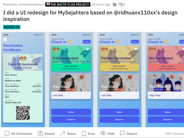
Tired of the bleak and dated visual that MySejahtera offers? This reddit user created an alternative design that makes it more appealing to scan QR codes every time we enter a premise.
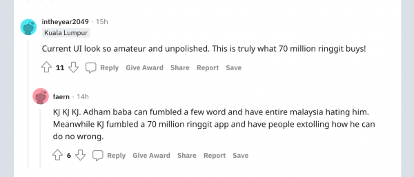
Netizens are commenting that this design is what the RM70mil-app should look like.
MySejahtera is a daily touchpoint for so many Malaysians during this COVID-19 pandemic, young or old, tech-savvy or not. Yet, people tend to struggle with using it for anything beyond checking-in to locations.
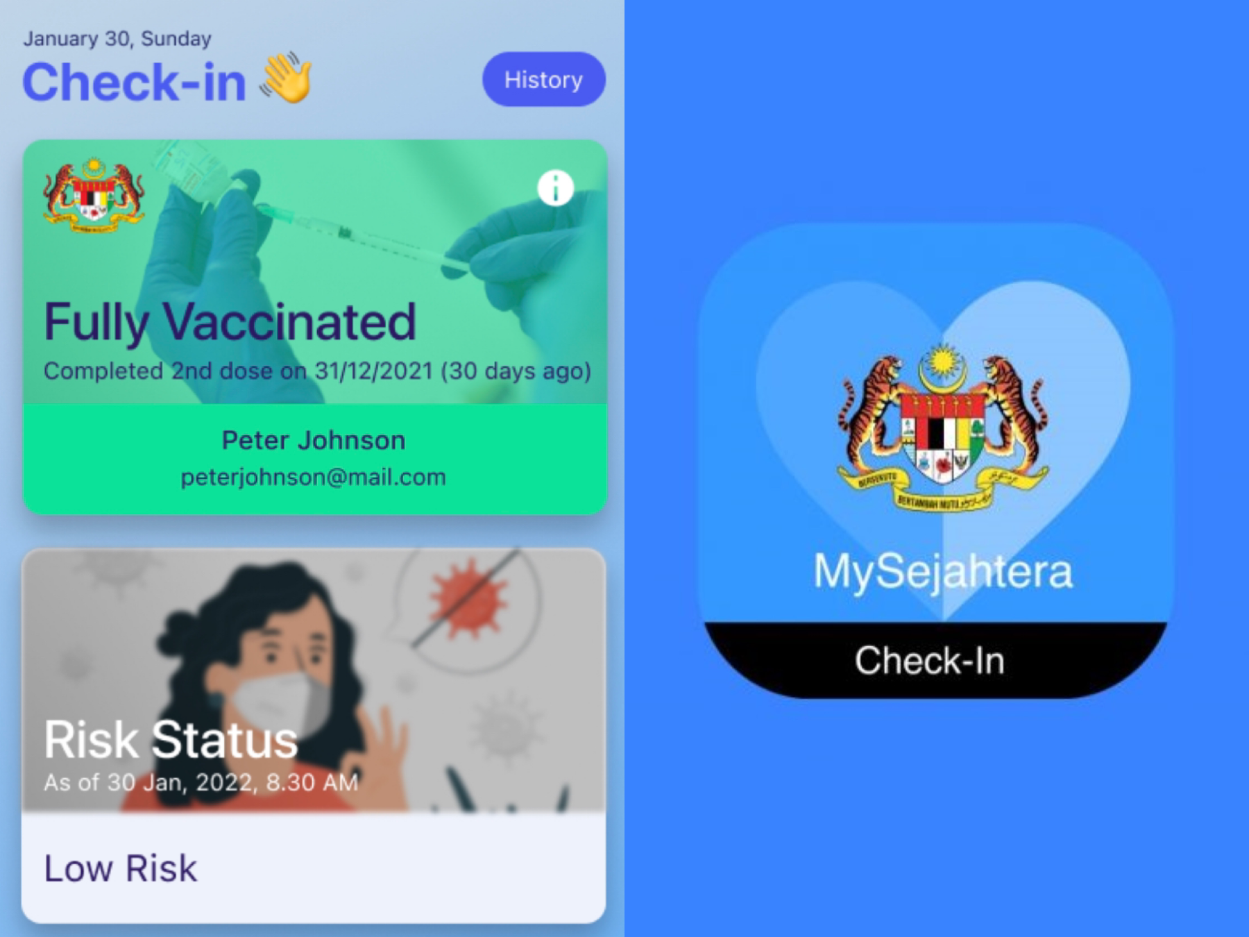
At first glance, the mock-up UI looks a lot cleaner and pleasant to look at—including the same colour palette used on the current MySejahtera.
The newly designed dashboard includes sections that easily lets users know what they are, in terms of vaccination progress.
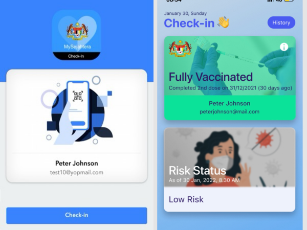
One of our biggest problems with the current MySejahtera is the lack of clarity in proving your low risk status. It’s unclear and hard to see.
The general look of its UI is reminiscent of websites created in the early 2000s, it’s kind of disheartening that something so important to Malaysia is still using a look reserved for vintage internet throwbacks.
From this MySejahtera user, I hope this gets picked up and urges a re-design on the interface!
Catch up on these articles:
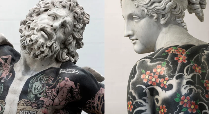
PHOTOS: Italian Sculptor Recreates Classic Marble Statues with Modern Gang Tattoos
Art imitates prison gangs.