Netizens Do a Better Job At Designing the Latest Visit Malaysia 2020 Logo
 Thirsty for JUICE content? Quench your cravings on our Instagram, TikTok and WhatsApp
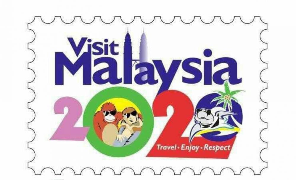
In case you missed it this weekend, surprise! That is our official Visit Malaysia 2020 logo.
We know what you’re thinking, and no, it wasn’t design by a 15 year old who just discovered Photoshop. According to a report by The Star, the Tourism & Culture Ministry did not spend a single cent on the logo, as it was designed by their very own in-house design department. Welp, that explains everything.
The logo was revealed last Friday by Datuk Seri Nazri Aziz in Chiang Mai, Thailand, with the tag line: “Travel. Enjoy. Respect.”
He justified the design by stating that the logo is comprised of icons best associated with Malaysia, like the Petronas Twin Towers, the most photographed tourism landmark in Malaysia. As for the animals donning sunglasses, Nazri explained that they are symbols previously used in Visit Malaysia Year campaigns, and that this repetitive use is to ensure that the animals are not claimed by other countries as their own tourism symbols.
“If we do not include these animals in our logo, other countries will claim them,” he said. “The logo was also designed to be colourful as Malaysia is a colourful nation,” he added.
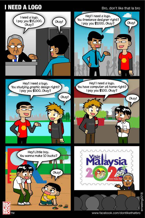
Instantly, the logo went under fire by comments from netizens on social media. Responses were mostly unsatisfied, calling out the design for not being up to standard. Some even think that the process of making the logo is like the cartoon below:
Despite all the negative feedback, the ministry is standing by it. Datuk Nazri replied, “Criticism is normal, we cannot get the consensus of the whole of Malaysia. If we want to wait for everyone to agree, even by 2020 it (the logo) will not be completed.”
“I’d rather trust my staff than the netizens. Anyway it was never meant for the locals, it was meant for tourists,” he continued.
That line alone provoked some Malaysians to take matters into their own hands, with a handful of creative netizens putting up their own take on Visit Malaysia 2020’s logo. Scroll down to see what they have come up with:
#1

#2
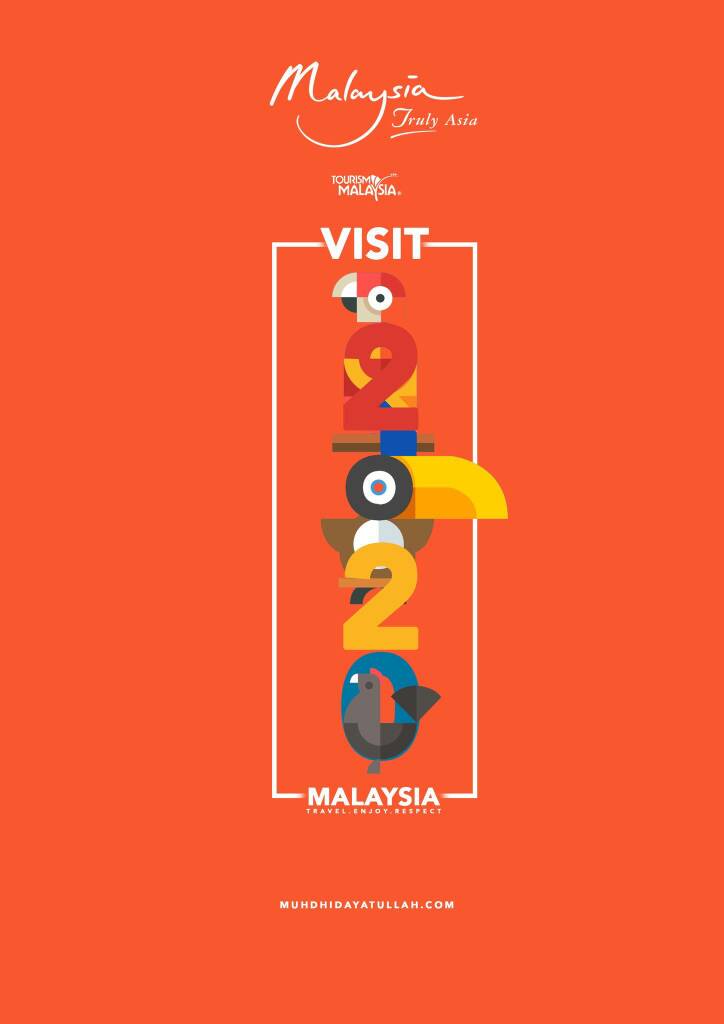
#3
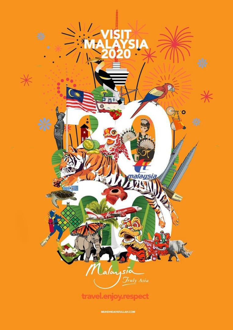
#4
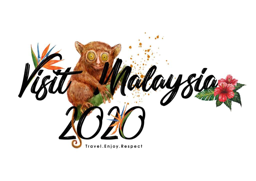
#5
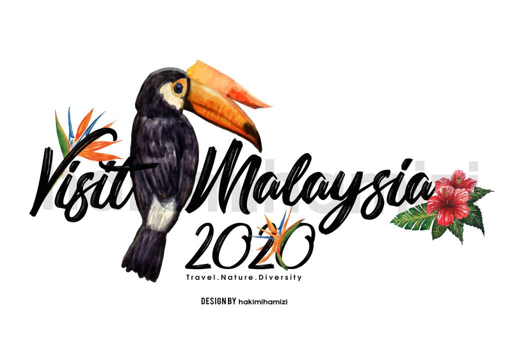
#6
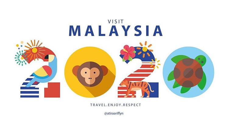
#7
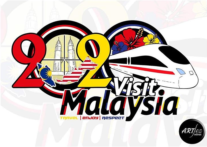
#8
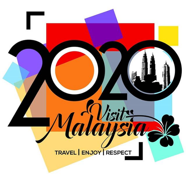
Based on the designs above, it’s safe to say that the netizens did it better. Visit Malaysia Year 2020 is aimed on bringing in 36 million tourists to the nation, and we can all agree that the first impression is everything – we just hope that the latest logo isn’t off-putting for future tourists.
For more news, click here.


 Get Audio+
 Hot FM
 Kool 101
 Eight FM
 Fly FM
 Molek FM