What Happens When Designers Follow Stupid Requests
 Thirsty for JUICE content? Quench your cravings on our Instagram, TikTok and WhatsApp

Malaysians had a good time laughing at the recent Visit Malaysia 2020 logo design (and ourselves), so much so that we decided it was time to pull this Japanese designer’s horror story out of the vault.
Before you use this as an example to lay down some basic guidelines to your clients, it’s wise for us to assume that the origin of this ad is probably as a joke done by Nissin Cup Noodles.
Designers and clients see everything so differently that it’s just a question of time before conflicts start to happen. This ad/visual-disaster hits the very core of the problematic relationship between the two groups and shows why designers and clients can never be friends.
So here it is – the ad that every brand dreams about but not a single designer would like to produce, and how it got this way.
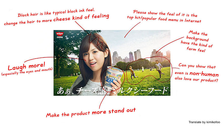
Original design seems casual and easy on the eyes

The client, however, decided the picture needed improvements. According to the designer: “Please allow us a moment while we fix some mistakes brought up by the client. They say it’s not cheesy enough…”

Their first round of edits led to this:

But it clearly wasn’t futuristic enough…
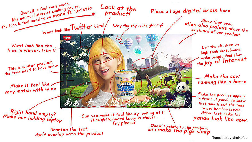
Ta-da! Here’s the final edit.

But hey, even this is better than our Visit Malaysia 2020 logo.
For more design stories, click here.


 Get Audio+
 Hot FM
 Kool 101
 Eight FM
 Fly FM
 Molek FM